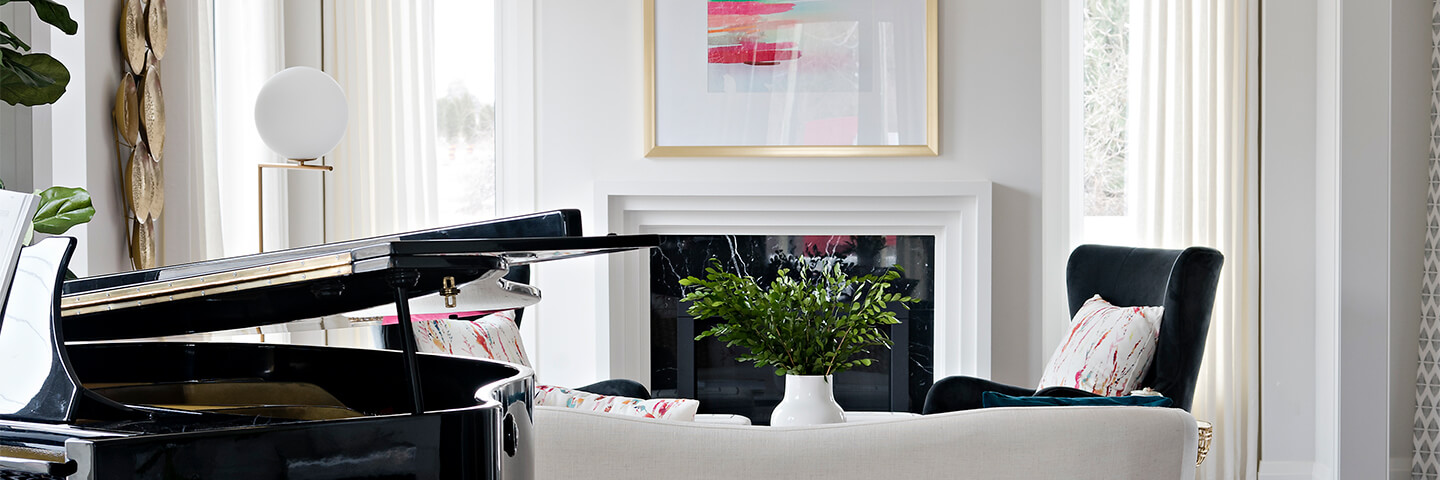
A Modern Classic

When it comes to Form and function, it pays to think outside the box! Take a look through a recent article in Interiors Magazine’s Summer 2019 Issue, featuring Lindvest’s new model home at Aurora Glen.
So many people struggle with space planning their homes. How you hope to use the space and how you actually use the space can be vastly different. With careful observation and a little thinking outside the box, you can create a home that truly functions for you. As a designer, I continually remind my clients that how we think a room should function is not always how it works best.
The longer you live in a space the less you see its flaws and how it’s not functioning as well as it could. As a designer I look at it with an outsider’s perspective. This is exactly what we did recently for Lindvest Homes. They hired us to design and decorate a model home for their Aurora Glen community.
When creating the design for this newly built home, it was important that the space felt classic and contemporary. As a designer, my goal is to always create spaces that feel modern, classic and comfortable. Using contemporary fabrics and traditional details with the crown moulding certainly helps to achieve this. We wanted this home to be welcoming and fit a modern family’s lifestyle. So we converted the traditional living room into a home office and repurposed the formal dining area. Our goal was a home that could be both fun and functional for social gatherings while offering quiet areas, like the fireplace to enjoy curling up with a book.
Having a little fun with colour adds to the family-friendly vibe in this house. A bright, bold area rug in the family room adds personality to the otherwise classic bones of this home. Adding the coffered ceiling detail and large crown moulding elevates the design. A soft palette in the kitchen, with rich, leathered granite counters and marble backsplash tile add texture and warmth. The kitchen is the heart of the home and needs to function but also be interesting to look at. We decided to add in a glass cabinet to display items, with easy access to cookbooks. The wallpaper backing is a whimsical touch. We used trending matte black and soft greys to contrast the warm brass.
Consider changing out the purpose of a room to suit your lifestyle. In this house, for example, we swapped out the traditional living room at the front of the house for a home office with custom built-in shelving. The backing on the shelves was clad in a rich navy grasscloth to add depth. A convenient place to sit back and read a book or perhaps work from home.
Throughout the home, the traditional-style interior doors are painted a rich contemporary black with sleek, matte black door handles to match. The hardwood flooring through the main floor balances with natural marble mosaic tiles in the entry and powder room. The powder room is a true gem and boasts a hidden corner with playful wallpaper and sleek black faucet. It’s a fun little surprise waiting around the corner for guests.
The second floor has four bedrooms, two bathrooms and a laundry room. Each bedroom has its own unique details and character. At the top of the stairs is a fresh and well-organized laundry room with upgraded cabinetry for storage and a hanging rod for drying.
The master ensuite is a true jewel with its wallpapered tray ceiling. A bright and spacious corner bedroom leading into a large ensuite, complete with soaker tub, curbless glass shower and double vanity. We chose to up the wow factor here by adding gorgeous large-format tiles to all the walls. The soft greys match perfectly with the marble mosaic floor tile and grey stone countertop. The cool grey tones contrast beautifully with brass faucets and fixtures. A stunning modern chandelier hangs above the tub, adding extra sparkle.
In the remaining three bedrooms, we created a nursery, kids’ room and guest suite. The nursery is playful with fun fox accent wallpaper and modern accents. The kids’ room has a secret closet/den where homework can be done, and clothes can hang in the custom wall closet. Adding a sliding barn door to separate the two areas allows you to hide any teenage mess!
Creating a cohesive, functional home:
- Add personality to your spaces by using artwork, lighting, fabric and wallcoverings and change-up with the seasons.
- Re-think the room’s purpose and change-up to suit your everyday living.
- Create work, play and family spaces within your overall design plans.
Designer Rebecca Hay is principal of Rebecca Hay Designs Inc., a Toronto-based design firm specializing in classically livable family homes throughout the Greater Toronto-Hamilton Area. Known for her design work and appearances on various acclaimed HGTV shows, Rebecca is an active YouTuber; follow her daily design adventures on Instagram at @rebeccahaydesigns. RebeccaHayDesigns.com